Of all major operators, Golden Gate Transit has the highest total and net operating costs
BART has the lowest net cost per boarding of any Bay Area transit system
Muni has the lowest total cost per boarding of any Bay Area transit system
Introduction
How cost-effective is our public transportation system?
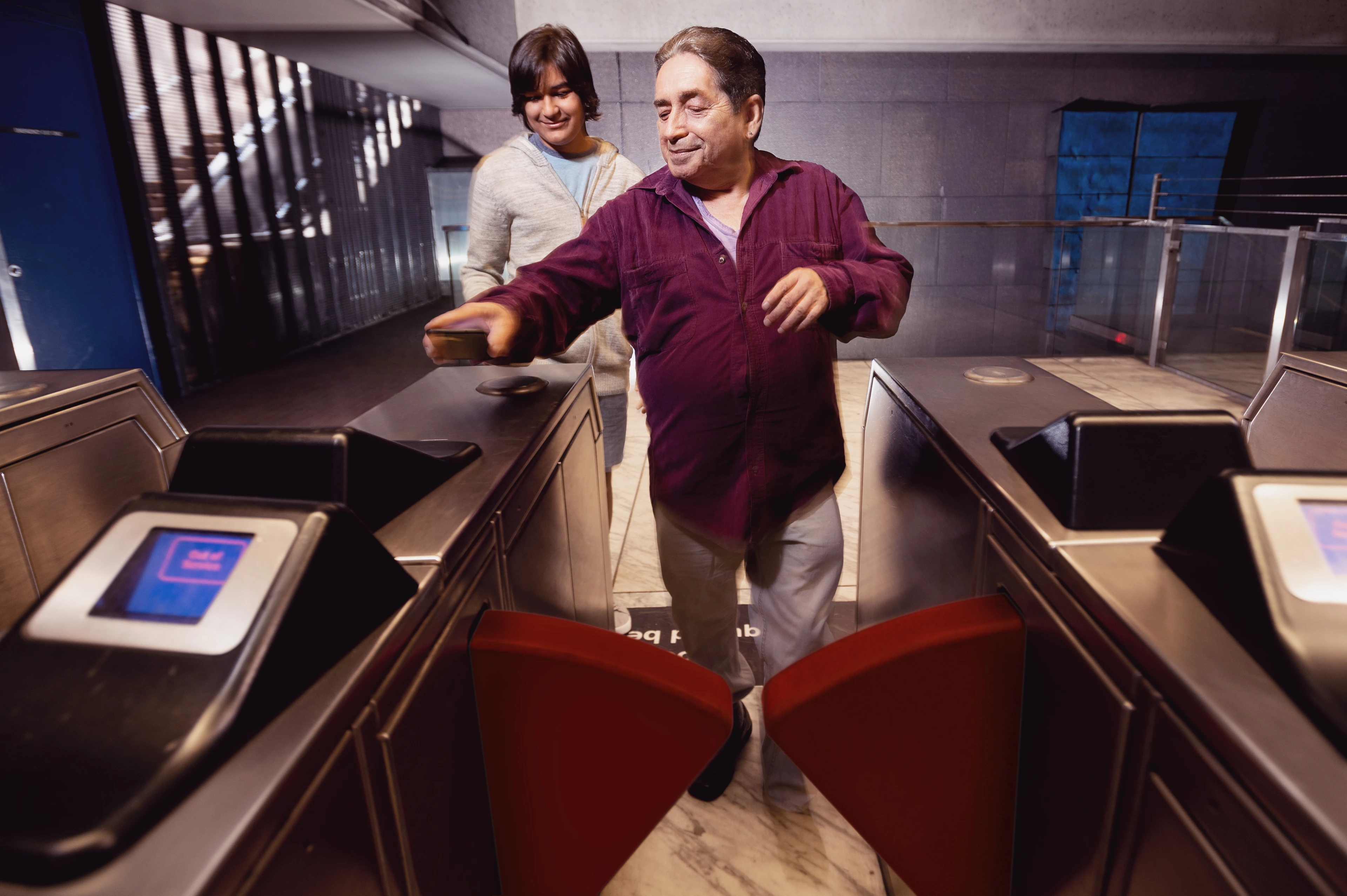
Bay Area residents benefit from one of the most robust transit systems in the United States. Even in lower-density suburban areas, frequent rail service and local bus connections are relatively common. But public transit is expensive to operate, and there is wide variability in cost-effectiveness across the region's numerous operators. As costs have increased, riders have borne an increasing share of this expense through higher fares.
Regional Performance
The Bay Area has stabilized transit operating costs and is also relying on larger fare contributions from riders.
Although per-rider operating costs ticked slightly upward in 2015, transit cost-effectiveness has been relatively stable over the last decade-plus. Combined with rising revenues from increased fares, the subsidy required to operate service (net cost per boarding) actually declined by 17 percent between 2003 and 2015. Booming ridership on higher-fare systems like Caltrain and BART has contributed to this trend.
Muni remained the regional leader for lowest total operating cost per boarding in 2015, although costs ticked very slightly upwards in the last few years. When it comes to net operating cost per boarding, BART and Caltrain have made the greatest strides in recent years. Both systems saw nearly 70 percent declines in the past dozen years, reflecting surging ridership on both systems. BART riders paid $3.43 out of each $4.29 in total cost per boarding, requiring only 86 cents in operating subsidy, whereas on systems like SamTrans and VTA it was around $1.00 out of $7.00, requiring $6.00 in operating subsidy in 2015.
of VTA operating funds came from fares in 2015, the lowest of any major operator
of all Caltrain operating funds came from fares in 2015
of all BART operating funds came from fares in 2015
Historical Trend for Transit Cost-Effectiveness
Sources & Methodology
Simple modes were aggregated to combine the various bus modes (e.g. rapid bus, express bus, local bus) into a single mode to avoid incorrect conclusions resulting from mode recoding over the lifespan of the Federal Transit Administration's National Transit Database (NTD). For other metro areas, operators were identified by developing a list of all urbanized areas within a current Metropolitan Statistical Area (MSA) boundary and then using that Urbanized Area (UZA) list to flag relevant operators; this means that all operators (both large and small) were included in the metro comparison data. Financial data was inflation-adjusted to match 2015 dollar values using metro-specific Consumer Price Indices.
Federal Transit Administration: National Transit Database
Time Series 2.1 Data Table (2003-2015)
Federal Transit Administration: National Transit Database
Monthly Module Adjusted Data Release (2013-2014)
Bureau of Labor Statistics: Consumer Price Index
All Urban Consumers Data Table (2003-2015; specific to each metro area)
Image: Noah Berger